Given the growing deluge of horrifying stories and images surrounding the global COVID-19 pandemic over the past few weeks, it is easy to find yourself reacting in one of two ways, both of which are potentially dangerous and neither of which is justified by the data.
First, when faced with daily reports of increasing numbers of deaths, you might think the odds are so stacked against you, there is little point in taking the recommended steps to protect yourself from infection. Alternatively, you could find yourself paralyzed with anxiety, afraid to do anything, and sink into a nihilistic depression.
Neither is justified by the actual data. In fact, what the data indicate are:
The odds are in favor of you avoiding infection if you follow the recommended preventative measures (avoiding contact with or close proximity to others, regular washing of hands, not touching your face, and a few others);
Even if you are infected, the odds favor you not having to be hospitalized;
The odds on you dying from COVID-19 infection are very low.
But just how good are those odds really? More specifically, how do they stack up against the risks associated with other things we encounter and do in life?
To allay my own initial anxiety, I did a few quick calculations, based on the data available in the press, and found that, while the risk of death is certainly much higher than that of, say, dying in an airplane crash, you are much more likely to die of heart disease than from the novel coronavirus.
How much more likely? Numerically, the risk is a whopping 28 times higher. But be careful. Whenever you see risk comparisons like that, you need to pay attention to what is being compared with what. On their own, the numbers tell you nothing; absent a proper context, that factor of 28 is meaningless.
In fact, that caveat about context can be significant whenever numbers are quoted; it is particularly so when a number is given to compare risks.
In the case of COVID-19, I went into the details of my calculation in a post in my personal blog profkeithdevlin.org. I leave you to follow the link and read what I said there. The mathematics is not hard; indeed, it is just basic arithmetic, along the lines of some of the more recent preceding posts in the SUMOP blog. The important thing is to keep in mind what the numbers refer to. The ultimate goal is not to produce a number — an answer; rather, it is to understand the relative risks.
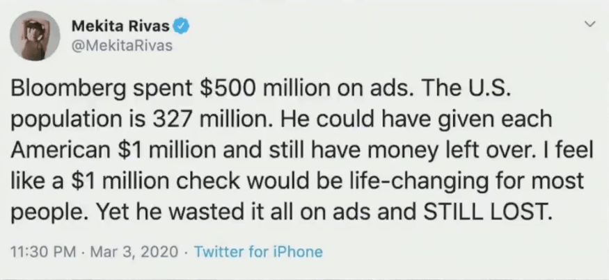
A segment about the 2020 presidential election primaries on MSNBC News on March 5 caused a flood of comments on Twitter. Here is the tweet that brought the segment into the Twittersphere and started all the ruckus:
Both the guest, a member of the New York Times Editorial Board, and host Brian Williams failed to notice how absurd was the arithmetical claim being made.
If this is the first time you have seen this segment, it likely flew by too quickly to register. Here (right) is the original tweet that started it all.
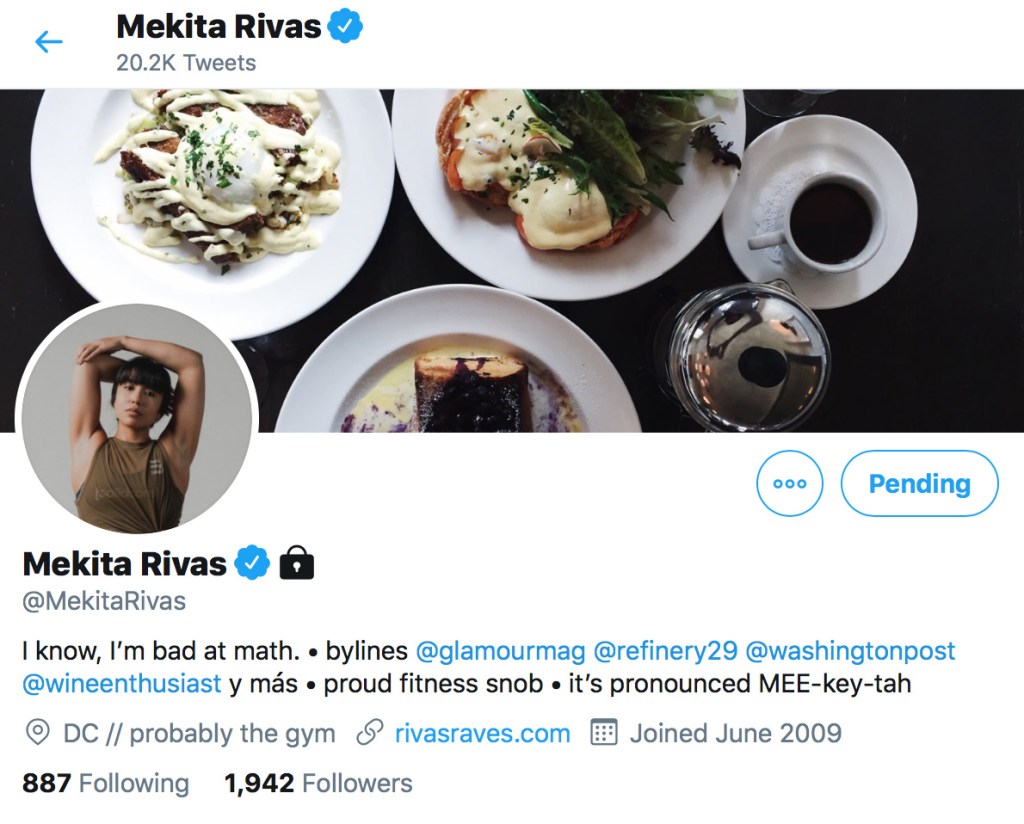
Curious as to who put out the tweet, I checked her profile. (See below.) [Normally I anonymize tweets, even though they are public, but on this case the tweet was shown on live national television.] She starts out with the claim that she is bad at math. I have no idea whether she is or she isn’t. But that tweet does not show she is. It actually suggests she may be a better mathematical thinker than many – read on.
Many of the comments on Twitter lamented the poor arithmetical skills of the tweeter and the two media figures on the show. In fact, the story went well beyond Twitter. The next day, the Washington Post, no less, devoted an entire article to the gaffe.
The Big Lead took another swipe the same day, pointing out that the tweeter, Mekita Rivas, is a freelance writer and Washington Post contributor, and noting that the math disclaimer on her Twitter bio was a result of her oh-so-public gaffe.
But she was by no means alone. The error was repeated, or at least overlooked, by a whole host of smart media folk: Mara Gay, the New York Times editorial board member who brought it up in her on-camera conversation, the MSNBC graphics department, several producers, host Brian Williams himself, and likely more.
The episode is reminiscent of the numerical error made by a famous New York Times commentator that I wrote about in a post a few days ago (March 3). To be sure, both episodes highlight the clear need, in today’s data saturated and data-driven world, for all citizens to have a reasonably well developed number sense.
For this problem is not, as many critics of Ms Rivas claimed, that she cannot do basic arithmetic. I would not be surprised if she were no worse than most other people, and besides arithmetic skill became in-principle obsolete with the introduction of the electronic calculator in the 1960s, and in every practical sense became really obsolete when we entered an era where we all carry around an arithmetic powerhouse in our smartphone. [There is educational value from teaching basic arithmetic, but that is a separate issue.]
What is most definitely not obsolete, however, and is in fact, a crucial human skill in today’s world, is number sense. What was worrying about the whole Twitter–MSNBC episode is that none of those involved recognized instinctively that the claim in the original tweet was absurd.
The two follow-up news articles I just referred to delve into the absurdity of the error, which comes down to the difference between $1M+ and $1.52.
But this is where it gets interesting. What is it about the statement in the Rivas tweet that led a whole host of smart professionals to not see the error? What led them to not feel in their bones that the amount every American actually would receive from Bloomberg would be “something a bit north of a dollar-fifty” and not a sum “in excess of a million dollars.” This is not a question of calculating; it’s not poor arithmetic. It’s something else, and it’s far more dangerous. Doing arithmetic is something our iPhone can do, quickly, error-free, and with more numbers, and bigger numbers, than we computationally-puny humans can comfortably handle. Understanding numbers, on the other hand, is very much people stuff. Our devices understand nothing.
If a whole group of smart people are so quantitatively illiterate (and that’s what we are talking about) that they don’t instinctively see the Rivas error , how can we as a society make life-critical decisions such as assessing our personal risk in the coronavirus outbreak or the degree to which we should take a candidate’s climate change policies into consideration when deciding who to vote for.
Many of the videos and blogposts on (and referred to on) this website focus on number sense, and discuss how best to ensure no future citizen graduates from high school without adequate number sense. (The Common Core State Standards are designed to achieve that goal, though teaching practices often seem to miss that point, sometimes as a result of inappropriate administrative pressure coming from poorly informed politicians.)
What interested me in particular about the MSNBC example was the nature of the error. It’s similar to the example I discuss at the end of the first of the Blue Notebook videos on this site, in that the way the proposition is worded triggers learned arithmetic skills (more accurately, and appropriately derisive, “test-taking tricks”) that in general are reliable.
Here is the Rivas argument, spelled out:
1.FACT : Bloomberg spent $500 million on TV ads.
2. FACT: The US population is 327 million.
3. (FALSE) ARGUMENT: We are talking millions here. If you take the whole amount and divide it up among the population, everyone gets 500 divided by 327 (millions). Good heavens, that’s more than one million each!
Rivas is doing two smart things here – smart in the sense that, in general, they lead to the correct answer quickly with the least effort, which is what she (and you) likely needed to be able to do to pass timed math tests.
1. First, she says, everything is about millions, so we can forget those six zeros at the end of each number. [GOOD MOVE]
2. Then she says, we have to divide to see how much each person would get. That’s 500 divided by 327, which is around 1.5 (or at least more than 1). [GOOD MOVE]
3. Then finally she remembers everything is in millions. So it’s really $1.5M (or more than $1M). [EXCELLENT. SHE REMEMBERED THE SIMPLIFICATION AND PUT THE ZEROES BACK IN]
On its own, the idea behind each step is fine, indeed can be useful – in the right circumstances. But not, unfortunately, in this coupling! [I’m not saying she went through these steps consciously doing each one. Rather, she was surely applying a heuristic she had acquired with practice in order to pass math in school.]
The trouble is, if someone leaves school having mastered a bunch of heuristics to pass timed math tests – which is how many students get through math – but has not been taught how to think intelligently about numbers (and thereby develop number sense), then they are prone to be tripped up in this way.
Not convinced? Check out the example toward the end of that first Blue Notepad video. It’s a bit more subtle than the MSNBC example I am discussing here; in fact, more than half the people in every audience I have given that example to (under time pressure) get it wrong. The odds are, you would have too. But the overall message about math education is the same.
Ms. Rivas should take that disclaimer off her Twitter bio.
But maybe replace it by one that says, “I need to improve my number sense.” That’s a motto that – by my observation of the news media, social media, and society in general – would well serve the majority of people, including many who are good at “getting the right answer.”
I was wandering aimlessly round a county fair not long ago, and came across a stall with a game I remember playing as a teenager, many years ago back in the UK – and losing. [The image here is not the one I saw; I just pulled it from the Web for illustration.]
You pay an entry fee and are given three darts. The goal is (and this may vary, though likely not by much) that if two of your three darts lands in a card, you win a small prize, and if all three do you win a more substantial prize.
I remember that as a teenager I was surprised, and disappointed, when none of my three throws ended up in a card. Not one. After all, at first glance it looks as though the cards occupy most of the board, so the odds should be in your favor.
Understanding what is going on provided yet another great example of number sense, the topic I focused on in my previous two posts. Let’s do some quick calculations. As usual, they don’t have to be accurate; we can make simplifications.
There are 4 rows of 5 cards, so 20 cards in all. According to a quick google search, playing-cards typically measure around 2.5 in by 3.5 in. Based on that information, a brief glance at the photo shows that the cards are placed on the board with a vertical and horizontal separation of roughly 1.25 in, with an outer border roughly the same size. So we can conclude that the dimensions of the board are
[5 x 2.5 + 6 x 1.25 = 12.5 + 7. 5 = 20] in wide by [4 x 3.5 + 5 x 1.25 = 14 + 6.25 = 20.25] in high.
Which means the total target area is 20 x 20.25 = 405 sq in.
The area of a single card is 2.5 x 3. 5 = 8.75 sq in, so the total area occupied by the cards is
[20 x 8.75 = 175] sq in.
Hence, the proportion of the target area occupied by a card is 175/405, or approximately 0.43.
That’s less than half, so the odds are against you on each throw. Assuming your throwing is random, which for most of us is will be, your throws will fail to land on card 57% of the time.
The probability of getting all three darts to land on cards to win a “substantial” prize is 0.433, which is approximately 0.08. You will win a real prize only 8 times in 100 attempts.
In fact, the odds are against you even winning a small prize, since the probability of two darts landing on a card is 0.432, or approximately 0.2, so you fail to win anything at all on 4 of every 5 attempts.
So the game is fine for a bit of fun, where you play maybe one or two rounds. Especially if the stall is there to raise money for a worthy charity. But for most of us, this is definitely not financially wise.
As for skilled darts players, in a commercial setting, the stallholder will surely stop anyone playing once they recognize the contestant’s skill (as happens in casinos with blackjack), so even if you play well, the odds are still heavily stacked against you making a killing.
This tweet caught my eye a few weeks ago. It was from a well-known political commentator for a major US newspaper, who I follow. I am obscuring his name since his identity is not relevant to this post. What does bother me, is that an influential commentator with a large pulpit can display such a lack of number sense. (I still enjoy reading him; he has a good grasp of many things. But not where numbers are concerned.)
In fact, the tweet did more than catch my eye; it jumped right off the screen and nigh on blinded me. Regardless of whether the initial assumption is correct or not, the conclusion is so obviously wrong on simple numerical grounds.
As usual, a very simple, made-up example is all it takes to highlight the fallacy. Also as usual in such situations, virtually no mathematics is involved here, and no arithmetic beyond very simple stuff with whole numbers. Number sense is not arithmetic. The goal is to get a quick numerical sense of the issue
Assume that a worker making $25,000 a year in 2010 saw their wages rise by 5% over the ten-year period to today. They would now be making $25,000 + $1,250 = $26,250. Compare that with their boss, who made $100,000 a year in 2010 but whose income rose only by 2.5%. In 2020, they bring in $100,000 + $2,500 = $102,500. Their pay increased at half the rate of their low-paid employee, but that meant their income rose by twice as much.
As with the example of the “danger of drinking wine” I wrote about last time, it all depends on the base figures on which the percentages are calculated.
How close to reality is my made-up-on-the-spot, number sense example? I googled “rise in wages”, and immediately found myself looking at a recent report from the Brookings Institute that gave me all I need. (I chose a page from a source I knew to be reliable.) For the low-paid worker, my example was not too far off. From 2010 to 2018, the bottom 10th percentile of hourly wages grew 5.1%. But I was way off with my number for the boss. In fact, the entire top 90th percentile of workers saw their income go up by an average of 7.4%.
What this tells us is that the opinion writer not only has poor number sense, he is not even able to get his underlying numerical facts right. Of course, you might say the writer set out to deliberately mislead. That’s possible, I suppose, but I doubt it. His article was in a major national newspaper that has fact-checkers, so both he and the publisher knew that his claims could easily be checked. To continue doing his job, readers have to trust him. Much more likely, I think, the issue was innumeracy. Like many people I know, when faced with figures, both the writer and his editor likely found their eyes glazing over.
Yet to anyone with number sense, the writer’s tweet jumps off the page as being absurdly wrong. What the actual numbers are does not matter. Even if his assumption about the relative rises had been correct, his conclusion would be false, as my initial made-up example showed.
In fact, my one use of google showed that even his starting point was off-the-charts, factually wrong: wages of higher-paid workers had risen a lot faster than for those at the bottom.
The sad fact is that the majority of people in the media have very poor educational backgrounds in mathematics, science, or engineering. Numbers are alien to them.
Given the huge significance of numerical data in today’s world, that tells us that our educational system needs to change. Arguing about the pros and cons of teaching Algebra 2 or Calculus seems totally misplaced, when we are producing so many people who lack basic numeracy.
In the meantime, if we cannot rely on the media to get the numbers right—by which I mean, ballpark, number-sense, appreciate-it-when-you-see-it right—then it is up to we citizens to protect ourselves from being misled.
And, for those of us in the education business, to make sure our students can be both good consumers of quantitative information and good communicators of numerical data.
A family member alerted me recently to the Medium article with the above headline. Knowing I have a long-adopted European lifestyle habit of having a glass (sometimes two) of wine with a meal, she was concerned about what seemed to be a significant health risk.
The article led off with this paragraph:
It was so comforting to think that a daily glass of wine or a stiff drink packed health benefits, warding off disease and extending life. But a distillation of the latest research reveals a far more sobering truth: Considering all the potential benefits and risks, some researchers now question whether any amount of alcohol can be considered good for you.
As a scientist, I am always open to being convinced by hard data. So I read on. The article rapidly became more alarmist:
For years, moderate drinking — typically defined as one drink (such as regular beer or a glass of wine) per day for women and up to two for men — had been billed as a way to reduce the risk of stroke, in which a vessel carrying blood to the brain bursts or is clotted. But a study earlier this year, involving more than 500,000 men and women in China and published in the Lancet, refutes that claim. “There are no protective effects of moderate alcohol intake against stroke,” says one of the study’s co-authors, University of Oxford professor Zhengming Chen. “Even moderate alcohol consumption increases the chances of having a stroke.”.
Wow!
While not for a moment doubting the validity of the science and the conclusions the researchers stated, I nevertheless wondered if there were really any cause for alarm. Just how significant is the risk I am being exposed to as I sip my Pinot Noir? After all, from a scientific standpoint, a well-established increased risk of 0.5% can merit publication in a professional journal, but most of us would discount such a low increase when it comes to deciding to give up an activity that gives us a great deal of pleasure. Maybe the article writer was being unjustifiably alarmist.
In the case of moderate wine drinking, there is certainly a well-established correlation between countries where that is common practice and countries with longer life-expectancy—though as is often the case, establishing any causation is a tricky challenge. (I tend to think that the pleasure I get from a glass of good Pinot, together with the relaxed sensation is produces, has a net beneficial effect on my overall health. That’s a plausible assumption, but did the new study show that effect was outweighed by negative consequences?)
In fact, the article quoted far more alarmist figures:
The study, published in the Lancet, found a “strong association between alcohol consumption and the risk of cancer, injuries, and infectious diseases.” Among other findings, just one drink daily was linked to a 13% increased risk of breast cancer, 17% increased risk of esophageal cancer, and 13% higher risk of cirrhosis of the liver.
Those percentages definitely grab the attention. But again, while not for a moment disputing them as valid scientific findings, I wondered how significant they are in making a life decision.
Time to do some quick calculations.
According to the article, 88,000 people in the United States die each year from alcohol-related causes. Let’s assume the bulk of those are adults (i.e., legal drinkers). The total population of people over 21 in the United States is about 200,000,000. So according to the figure quoted, the proportion of American adults who die from alcohol each year is 88 out of 200,000.
To simplify the calculation, let’s assume the situation is worse, and 100 out of 200,000 die each year. That’s 10 people in every 20,000. I dropped down to 20,000 because that’s something we can visualize, as many stadiums and arenas have capacities of around that number. A quick Google search revealed that the Amway Center in Orlando, Florida has a stated capacity of exactly 20,000.
The Amway Center in Orlando, Florida, seating capacity 20,000
I can now get a visual representation of the annual risk of death from drinking alcohol as 10 people in the crowded stadium. (Other well-known examples I came up with are Madison Square Garden in New York City, with a capacity just over 20,000, and Meadowlands Arena in New Jersey that comes in just under 20,000. Imagine ten individuals in either of those facilities.)
Personally, I don’t find that particularly scary. If it were not for the degree to which a glass of wine with my meal gives me significant pleasure, it would absolutely make sense to avoid the risk of being among those ten people in the stadium. But in my case, I’ll take that risk. Not least because I suspect that most of those deaths are from people who drink a lot more than I do. (The writer of the buzzkill article responsibly alludes to the far greater risks associated with excessive alcohol consumption and binge drinking, where to my mind the data cannot be dismissed.)
But the focus of the article was not on the base-level risks, rather the increased risks of one drink each day. That has me right in the crosshairs. What is the significance of that particular risk?
Again, let’s look at a scenario worse than the one reported, to make the math simpler. Assume there is an increased risk of 20% — bigger than those reported increases of 13% and 17%. That would mean 12 people in the Amway Center; 2 up from 10. Now I can visualize, and hence understand, my increased risk as follows. (I’m assuming I were not already in the danger group, but become so as a result of my daily glass of wine. Again, my goal is not to produce accurate risk data, but to visualize, and hence understand, the data presented. I am making simplifications that, if anything, create a picture showing greater risks than the actual data indicate.)
In any one year, 10 of those people in Amway Center will die as a result of alcohol. If you don’t drink, you will not be one of those 10. The increased risk as a result of having one drink daily enlarges that danger group of 10 people to a group of 12 people. At least to my eyes, the difference between 10 people and 12 people in that massive Center is nothing like enough to convince me to give up my daily glass of wine. I’ll accept the risk.
In my scenario, those two additional people in the audience are the ones who get there as a result of one glass of wine a day. Becoming one of those two individuals in the Amway Center are the ones the buzzkill article is warning us about.
Just to be doubly sure I’m being sensible, however—after all, I have a vested interest in convincing myself my wine habit is not unwise—I decided to google common causes of accidents and deaths.
According to my search, taking a shower turns out to be a dangerous activity. (For my entry “accidents in the bathroom”, Google returned over 22 million hits.) But what are the figures? In the U.S., roughly one person per day dies in the shower, mostly adults. In an adult population of around 200 million, that’s a low risk. But that’s the risk of death. Statistically of more significance, around 250,000 people aged 16-or-older per year have an accident in the bathroom that requires a visit to the emergency room (with 14% requiring hospitalization). That represents 25 people in Amway Center. We all accept the risk of being one of those 25 every time we step into the bathroom.
None of this is to say we should ignore the valuable evidence science provides when it comes to risks. On the contrary, I went through the above exercise because I habitually try to maximize my length and quality of life. Every action we take carries risks—including inaction. We just have to make wise decisions that balance the pluses and minuses of everything we do.
To do that, it helps to visualize the risks in some real-world scenario we are familiar with. I tend to go for movie theaters, sports stadia, and the like. It usually doesn’t require any complicated calculations; it’s number sense rather than arithmetic. Grab a few relevant figures from the Web and make gross simplifications that if, anything, make things worse than they really are.
In the situations described in the article, that “20%” figure refers to a 20% increase in size of the risk group. But if that risk group is already small, the increased risk group will still be small. In the case of moderate alcohol consumption, it corresponds in going from ten people in the vast Amway Center to being twelve in Amway Center.
But the question I asked—and everyone faces questions like this all the time—is this: Will I accept the risk if there is a personal cost to me. Once I had a clear way to visualize that risk, I found the decision easy. Pass the Pinot!
That’s not an endorsement or a recommendation. It’s my personal decision arrived at from a good understanding of the risks, based on hard data. (Hence no photo of a glass of wine.) Comparable data on risks persuades me to always fasten my seat belt in a car and never go out on my bike without a helmet. Why take a risk—however small—when there is no personal cost to avoiding it?
And that’s what this post is about: Applying number sense to make sense of numerical data in order to reach personally significant decisions. Once I had a good image in my mind to visualize the risks, I found the decision was easy.
But that was not the focus of the buzzkill article, where I found the complete absence of important contextual information to help readers understand what the data actually represents resulted in a story that I think is unduly alarmist. To repeat a recurring SUMOP theme, number sense is a critical mental tool in today’s data-rich world.